Project Overview
📝About: Website Redesign for Architecture Firm
📅 Timeline: March-June 2024 (10 weeks)
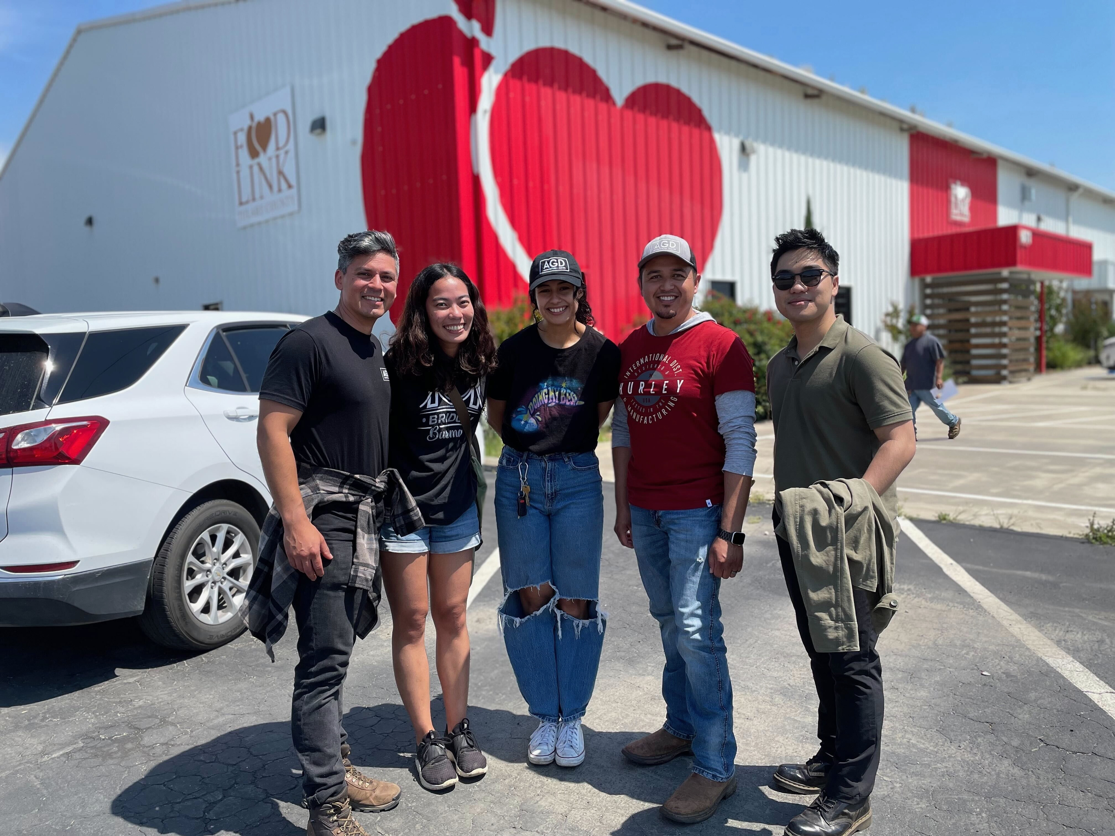
👯🏾Designer: Saddha Zaw
AGD is an Architecture & Design firm founded in 2015 by Andrew Goodwin with the primary office in San Luis Obispo, CA. The firm specializes in Residential, Commercial, Civic, and a recent addition of Education projects.
As the firm grows, there is a need for the website to more accurately reflect company mission + vision as well as showcase their capabilities featuring past projects that have won awards & recognition!
1. UNDERSTAND & EMPATHIZE
Process Overview
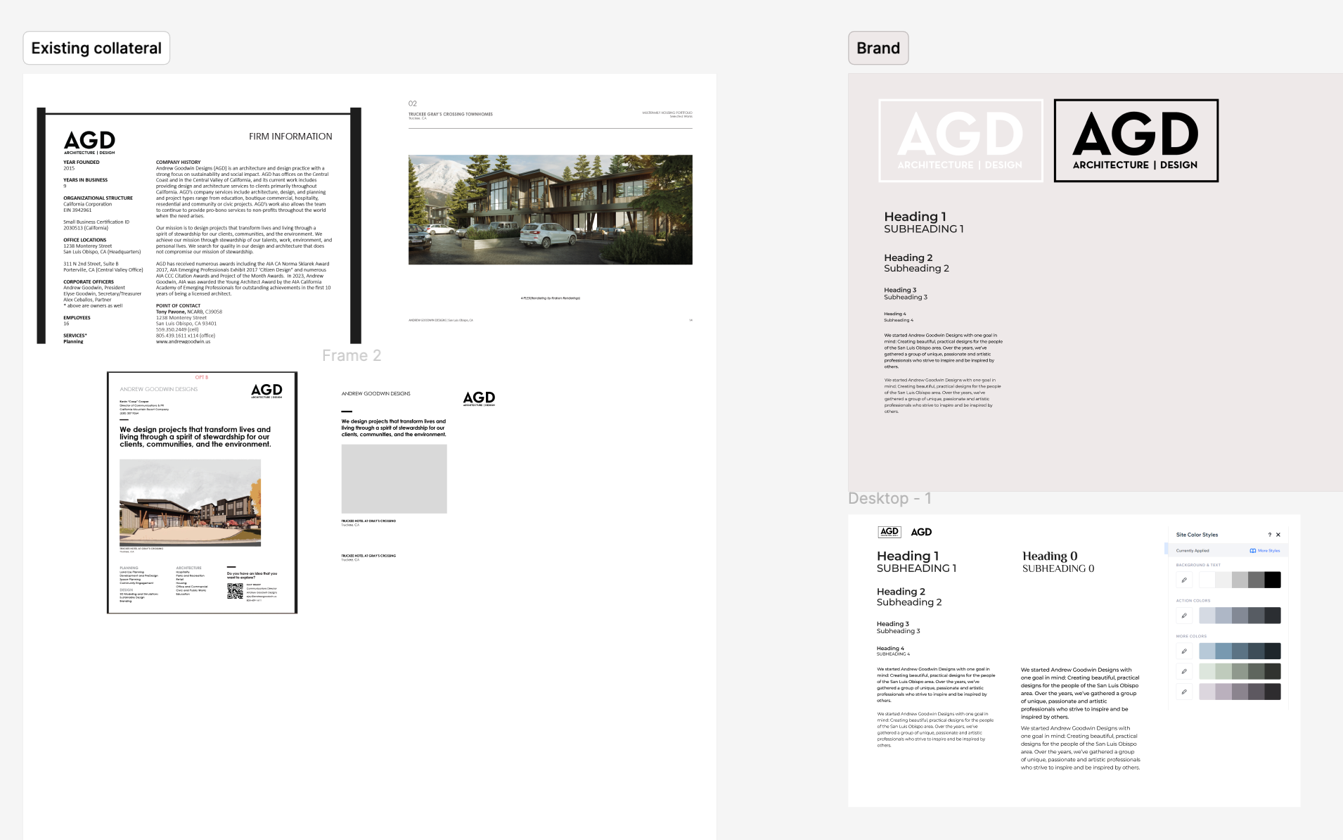
The first week and a half of this project were spent understanding the brand story of AGD, as well as doing an analysis of the existing website to identify pain points and goals. AGD has an existing website made on Wix that their Director of Marketing previously made, and wishes to keep using this platform for future updates.
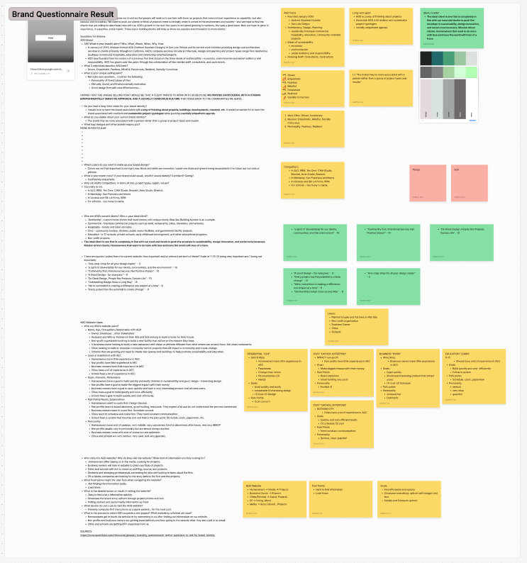
Brand Questionnaire
A brand questionnaire was crucial in helping the owner explicitly state the goals and objectives he wishes to communicate through the website that are already embodied by the firm but not necessarily showcased explicitly. Details and answers won't be shared, but below are questions I asked Andrew regarding the AGD Brand Story:
AGD What is your brand’s story? (Who, What, Where, When, Why, How)
What 3 adjectives describe AGD best?
What is your unique selling point?
Do you have a long-term vision for your brand identity? What do you dislike about your current brand identity?
What logo designs and other brands inspire you? Which colors do you want to make up your brand design? What is your brand voice? If your brand could speak, would it sound bubbly? Confident? Caring?
Who are AGD’s current clients? Who is your ideal client?
Who visits the AGD website? Why do they visit the website? What kind of information are they looking for? What frustrations might the user face when navigating the website? What is the desired action or result of visiting the website? What device do users use to visit the AGD website? What is the process in which AGD acquires a new project? What marketing collateral are used?
Quote From the Owner...
“AGD is looking to maintain and grow our brand so that people will seek us to partner with them on projects that need not just experience or capability, but also passion and innovation. We want to push our clients to think of projects more holistically when it comes to the environment and society - and we hope to find the clients that are willing to take these risks with us. AGD’s growth in the next five years is not about growing in numbers. We have a good base. Now we hope to grow in experience, in expertise, and in talent. These basic building blocks will help us show our passion and innovation to more clients.”
Problem Statement
The current website does not reflect the AGD brand and growing capabilities that the firm wishes to communicate. The three main pain points are: hidden/hard-to-navigate-to information, un-engaging home page, inconsistent UI elements & branding.
One of the goals of this website redesign is to present AGD as a team, rather than place emphasis on Andrew Goodwin.
2. ANALYZE & IDEATE
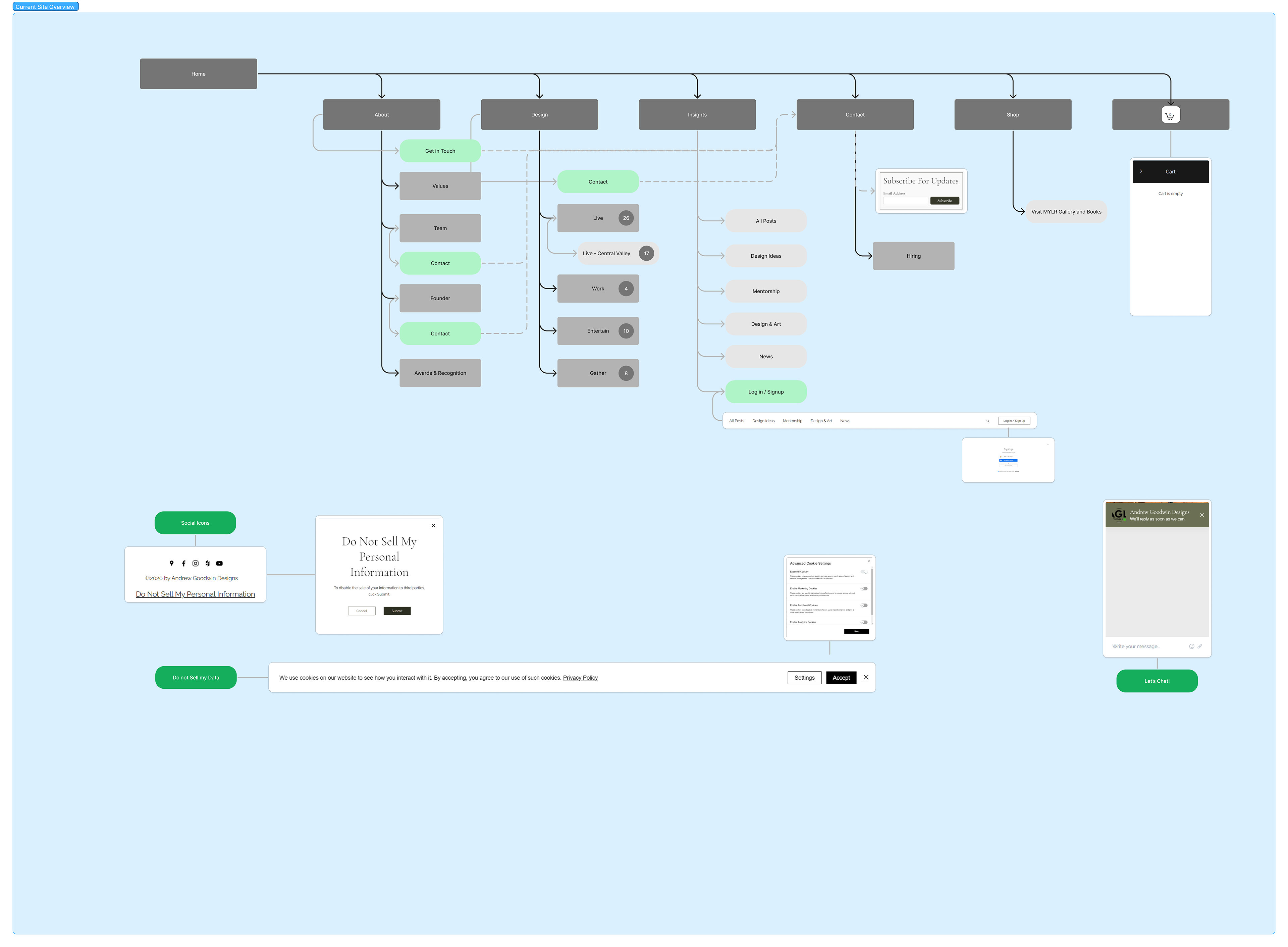
Current Site
In this stage, I started by analyzing the logic behind the IA of the current website.
Elements to Eliminate:
1. 'Shop' e-commerce page
2. "Do Not Sell My Personal Information" pop up on landing page
3. "Let's Chat!" Chat bot that is not actively monitored
2. "Do Not Sell My Personal Information" pop up on landing page
3. "Let's Chat!" Chat bot that is not actively monitored
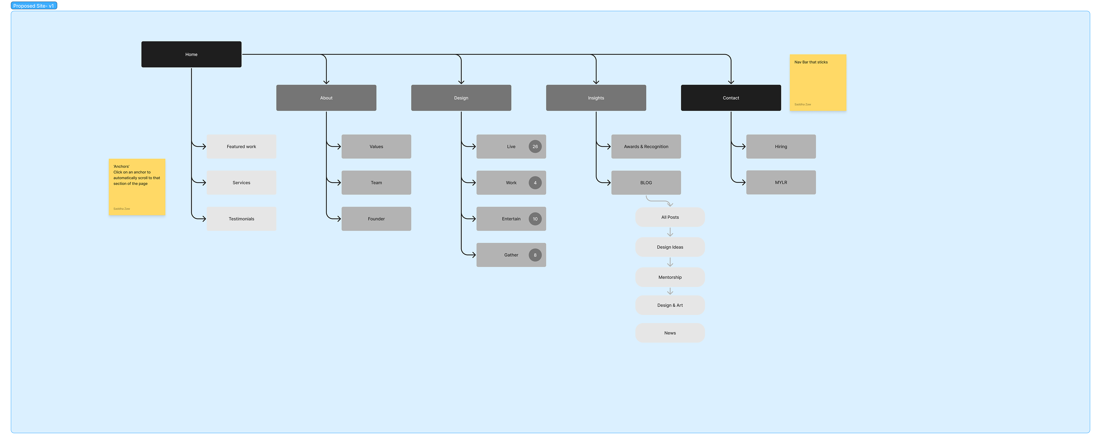
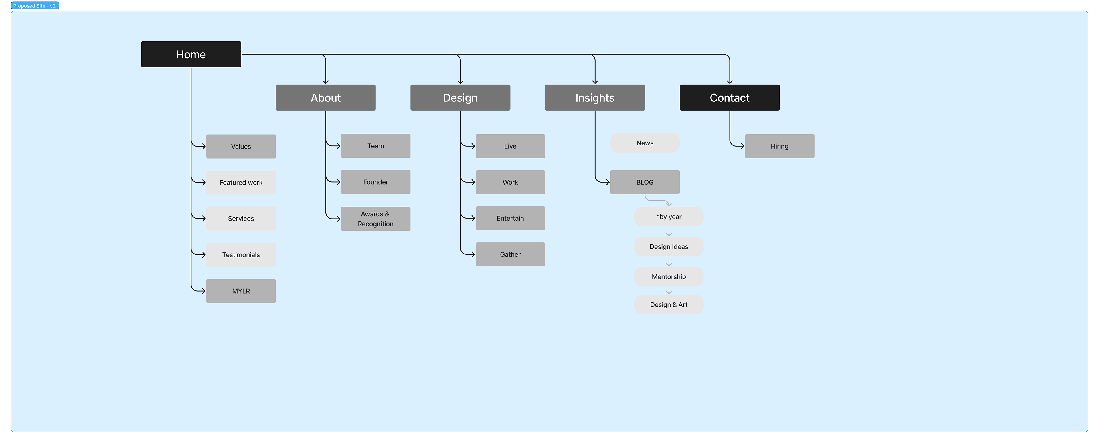
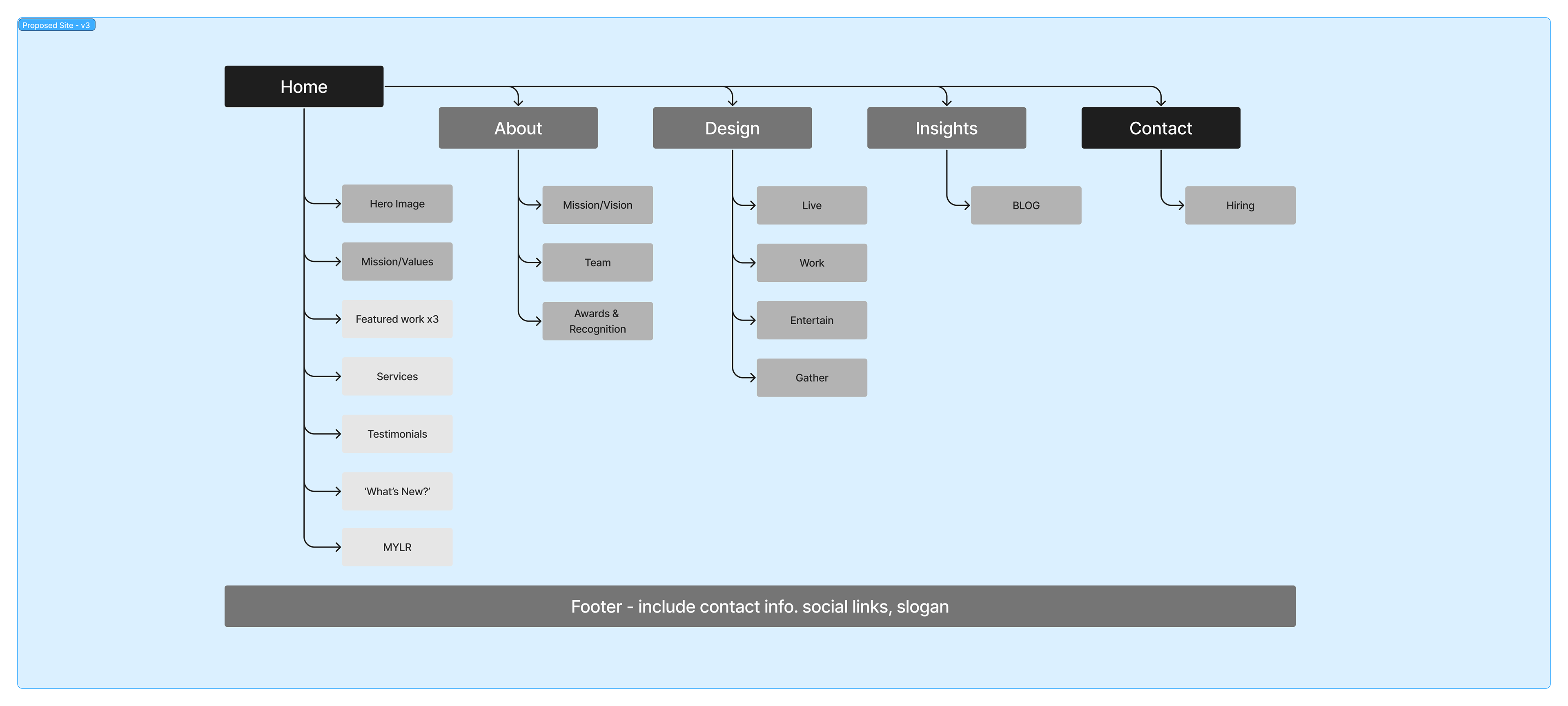
Proposed Site
The proposed site simplifies the information architecture by eliminating unnecessary pages and links. This was done through 3 iterations, with each becoming more simplified than the last.
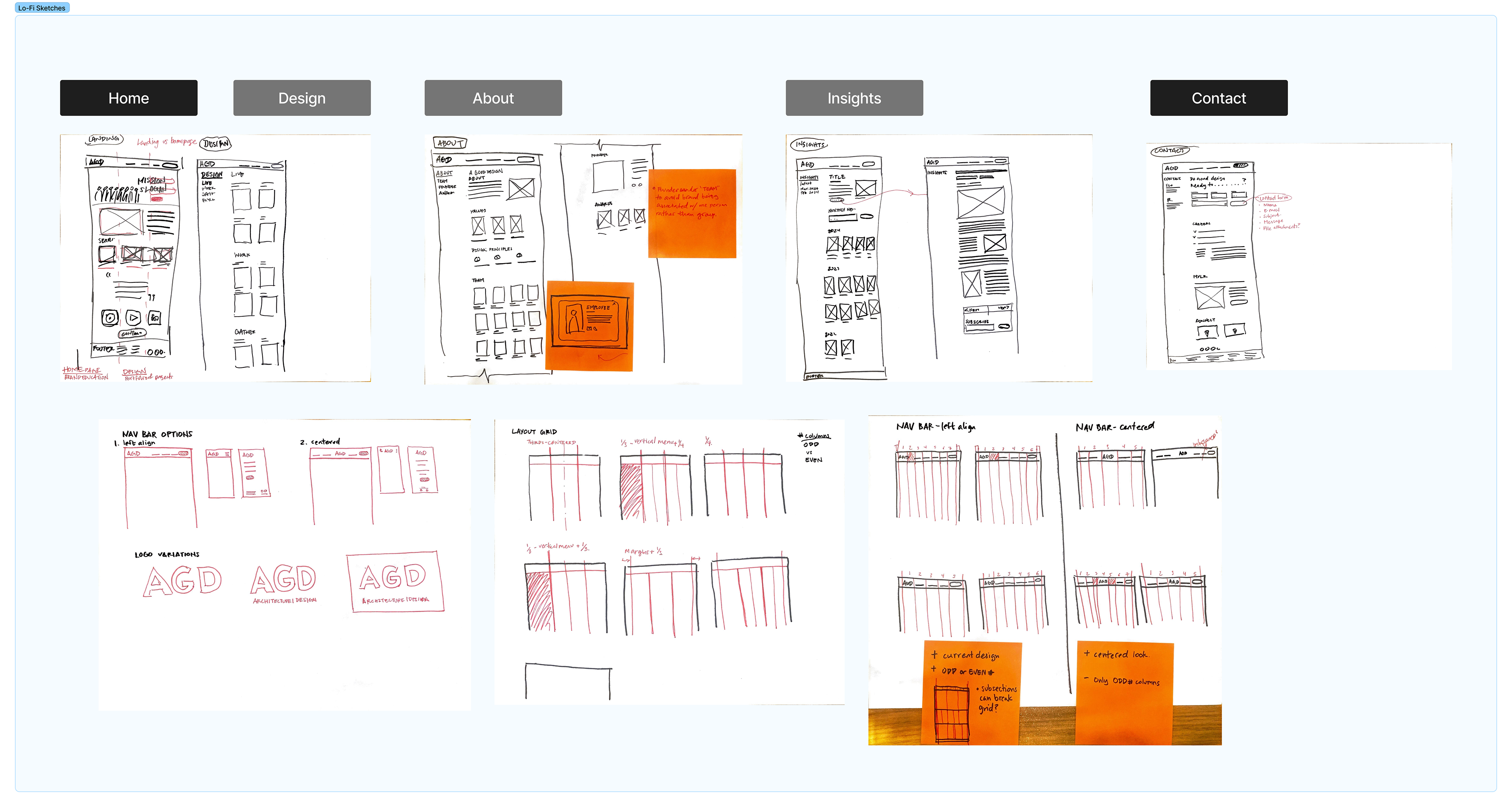
Wireframe Sketches
Then I sketched out wireframes on paper to start thinking of the interaction between the pages and the flow of information.
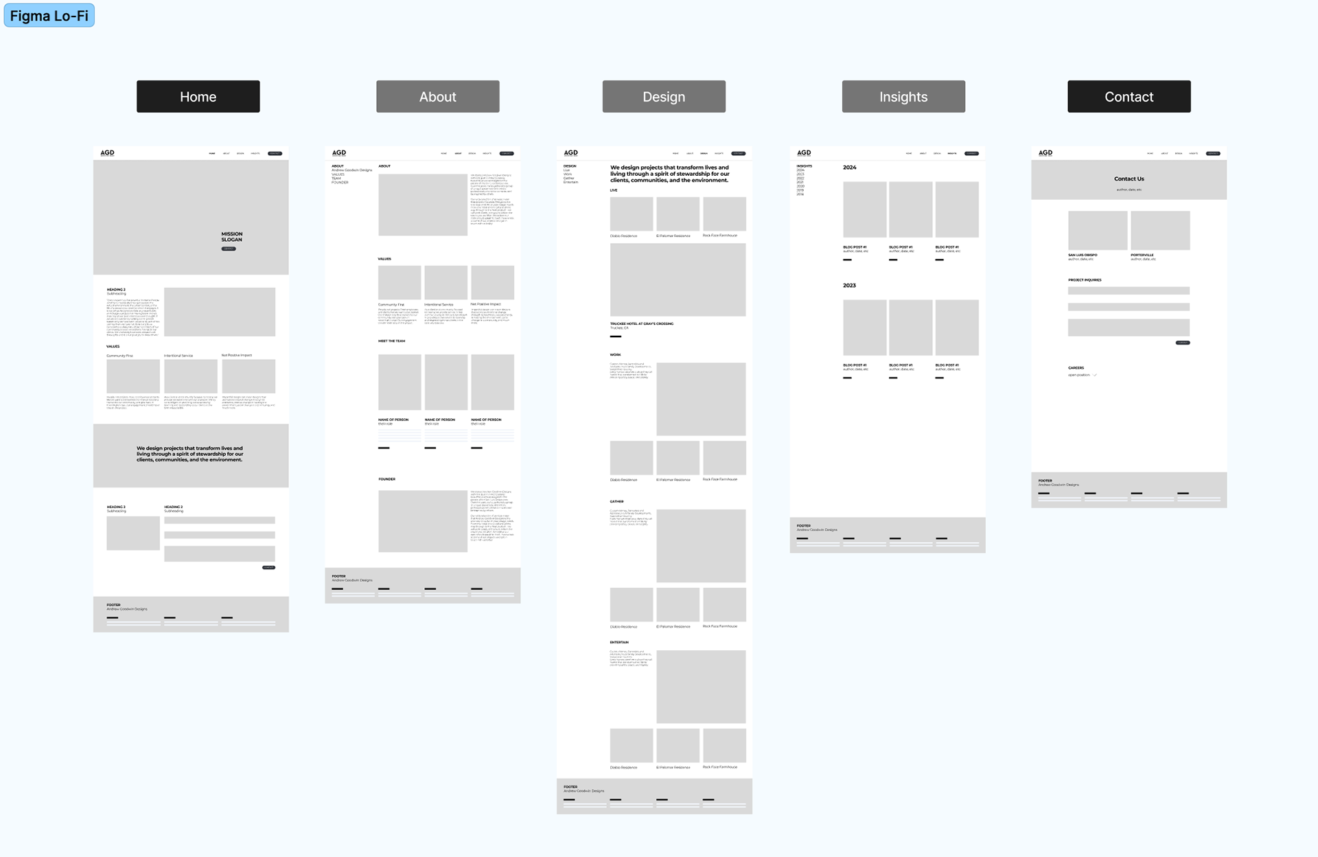
Figma Prototype
Transitioning into Figma, we focused our efforts on a mid-fidelity prototype by starting with digitizing our wireframe sketches. Utilizing Figma Community files helped a lot in this stage.
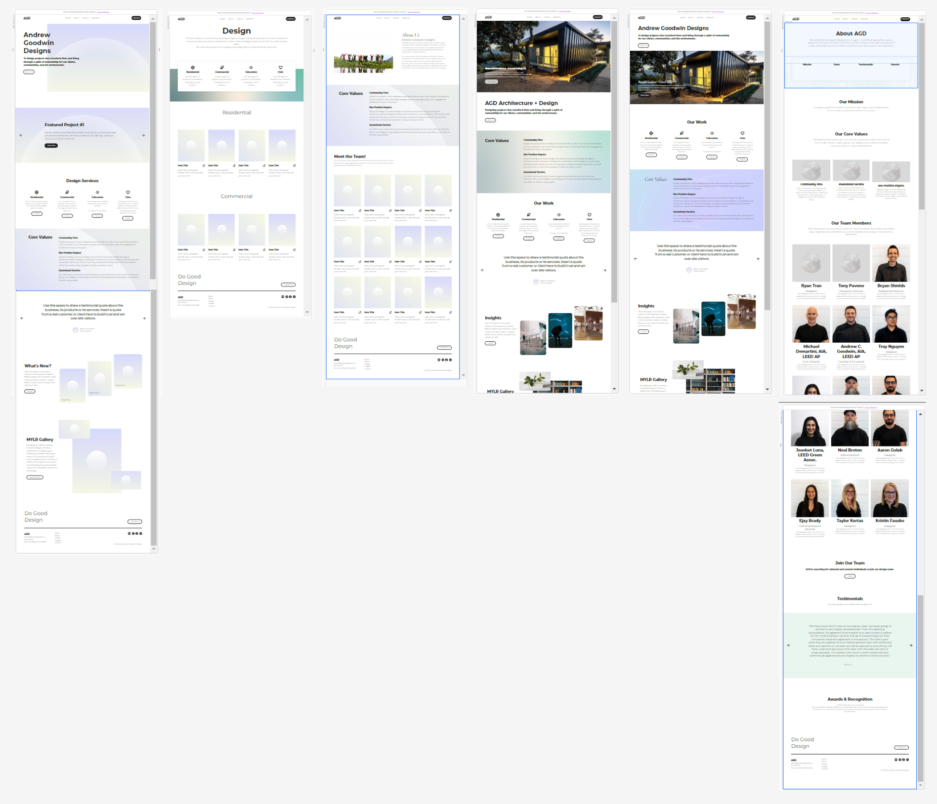
Wix Prototype
I then explored Wix Studio, carrying the design intent from Figma into real web pages. This stage is to ensure the flow of information goes correctly, taking users where they need to go.
Goals
1. Responsive design: user should be able to access information at 3 screen size breakpoints
2. Home page:
2. Home page:
Design System
Typography
Maintaining familiarity with the existing marketing collateral, Monsterrat font was used to establish a design system within Figma as well as Wix. This sans-serif maintains a clean and modern look and feel AGD wishes to keep on their website.
Color Palette
A standard black and white are used, with an accent of green.
A standard black and white are used, with an accent of green.
last, but not least...
Click the button below the visit the newly launched AGD website.
Conclusion
Although this was a 10 week project as a design team of one, I learned a lot in working closely with the AGD team to hear what the team members thought the strengths and weaknesses were of their old website.