
Project Overview
📝Prompt: Design a mobile application or web experience for a SLO local business of your choice.
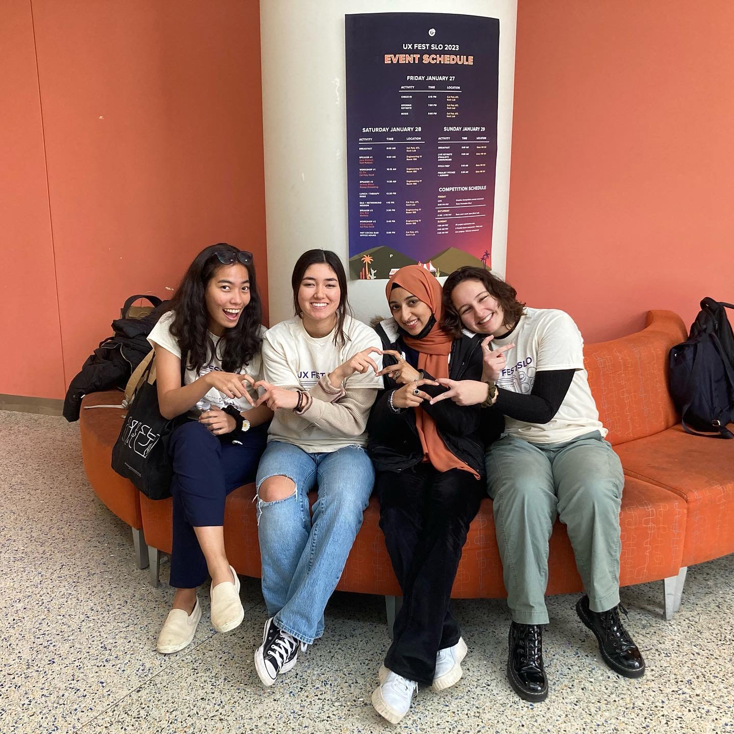
📅 Timeline: January 27th-January 29th, 2023 (36 hours)
👯🏾Team: Zara Iqbal, Claire Ogawa, Nicole Borden, Saddha Zaw
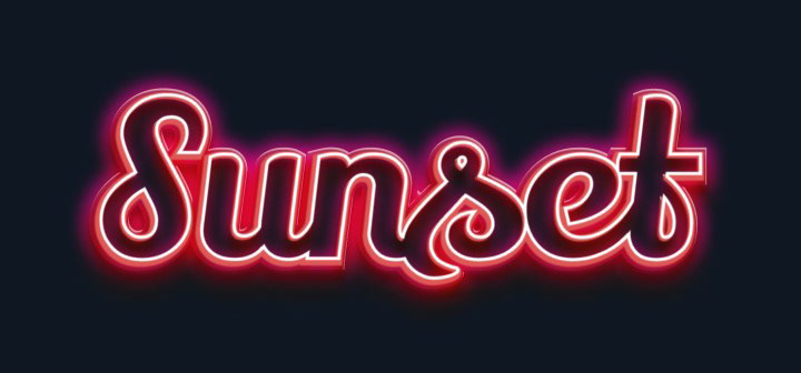
Sunset Drive-In is one of the last remaining drive-in theaters in California — however, their sole form of communication with their customers is a Facebook page. Our team decided to create a web experience that streamlines communication, bookings, and more.
user research
Survey
We sent out a survey to 38 college students in San Luis Obispo asking them questions about the Sunset Drive-In.
Here are the results:
Here are the results:
57% of users would prefer cash and electronic payment options
80% of users would prefer to navigate an online website for Sunset Drive-In
69% of users think displaying movie selection and showtimes is the most important feature
34% of users think online booking/reservations is the most important feature
Interviews
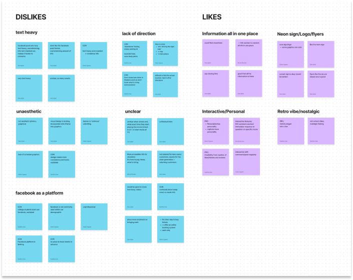
We also conducted 10 user interviews, asking Cal Poly SLO students to navigate the Sunset Drive-In Facebook page and tell us what it does well and poorly. We highlighted the main pain points (and positive features) to brainstorm our “How might we...?” statements.

How Might We...
From our sticky notes, we brainstormed HMW statements to reframe our insights into opportunity areas and innovate on problems found during user research.
1. How might we display all relevant information in an easily accessible way?
2. How might we communicate the desired look and feel (inviting/nostalgic/warm) of the business through visual design?
3. How might we include a feature to book tickets in advance?
4. How might we give directions to arrive seamlessly at the venue?
2. How might we communicate the desired look and feel (inviting/nostalgic/warm) of the business through visual design?
3. How might we include a feature to book tickets in advance?
4. How might we give directions to arrive seamlessly at the venue?
Problem Statement
Sunset Drive-in fails to effectively communicate basic information about its services to customers through a visually unappealing and difficult-to-navigate Facebook page.
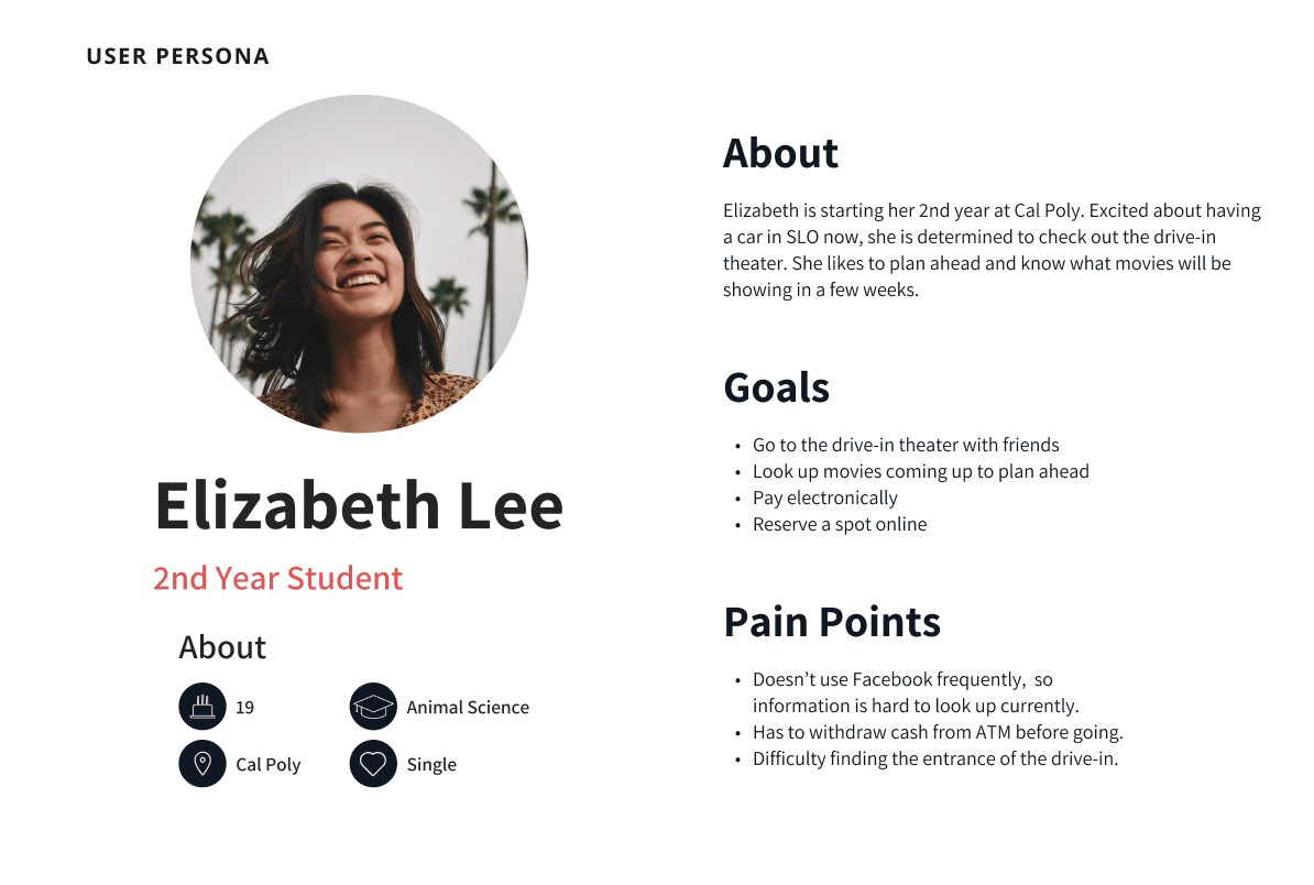
Persona
Synthesizing the information we've gathered thus far from our user research, we created a persona who will represent user needs, goals, and pain points to consider going forward in our design.
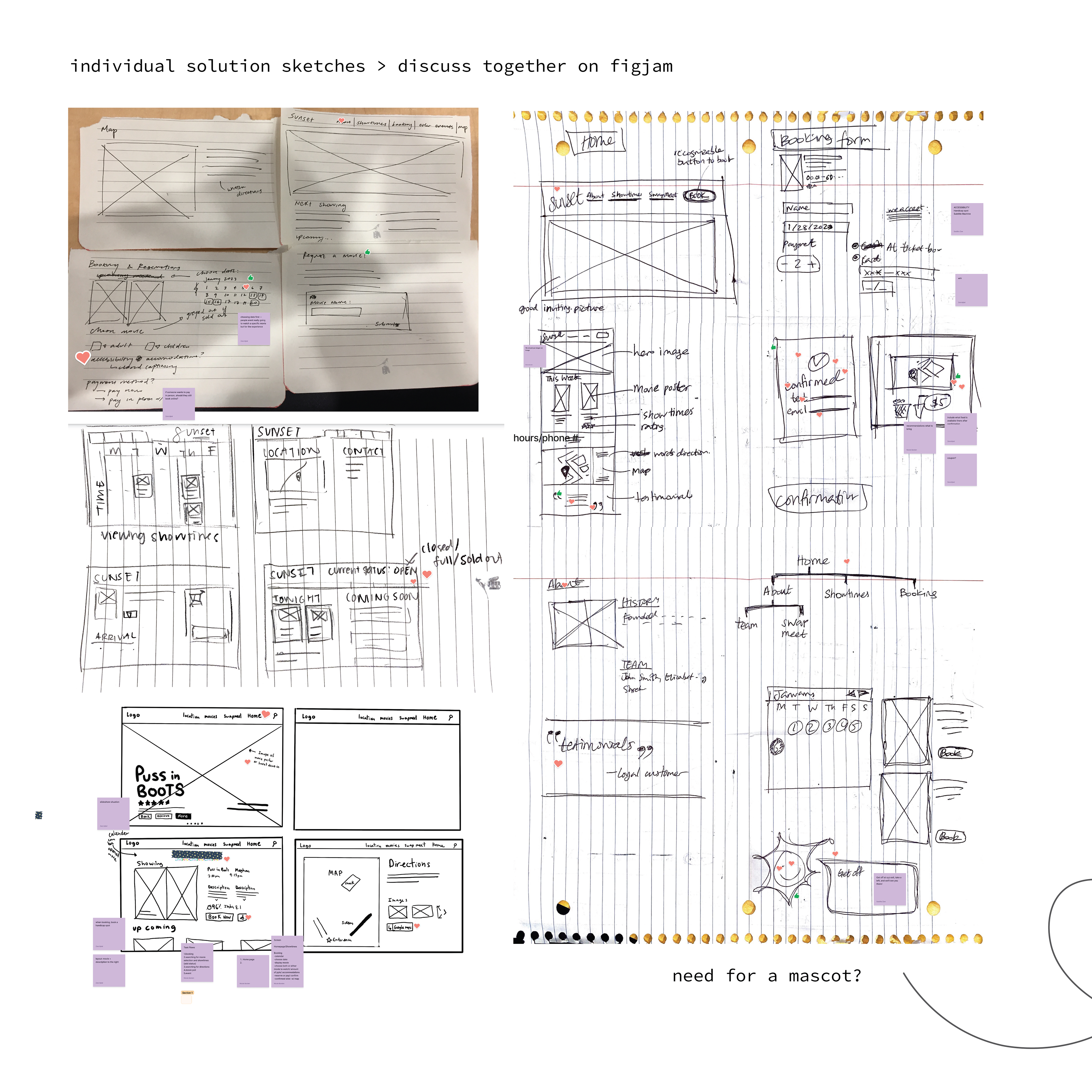
IDEATION
Fully understanding who we're designing for, our group set a timer to get started on solution sketches. In this stage of design, we focused on getting as many ideas out as possible. Then we came back together as a group to discuss what aspects we like best and believe we should incorporate in our next step. We did this on FigJam to make comments!
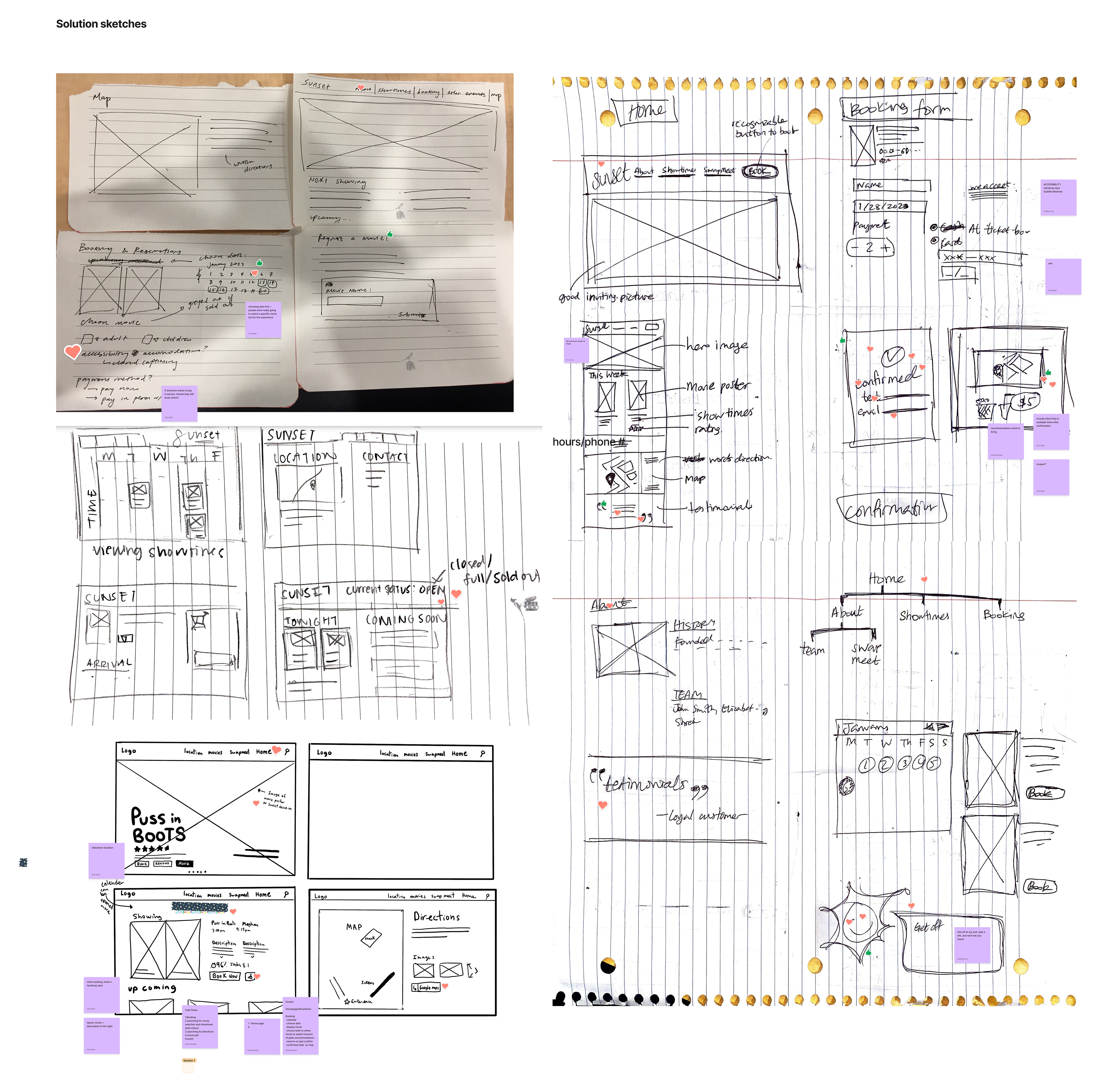
I did the sketches on the right column
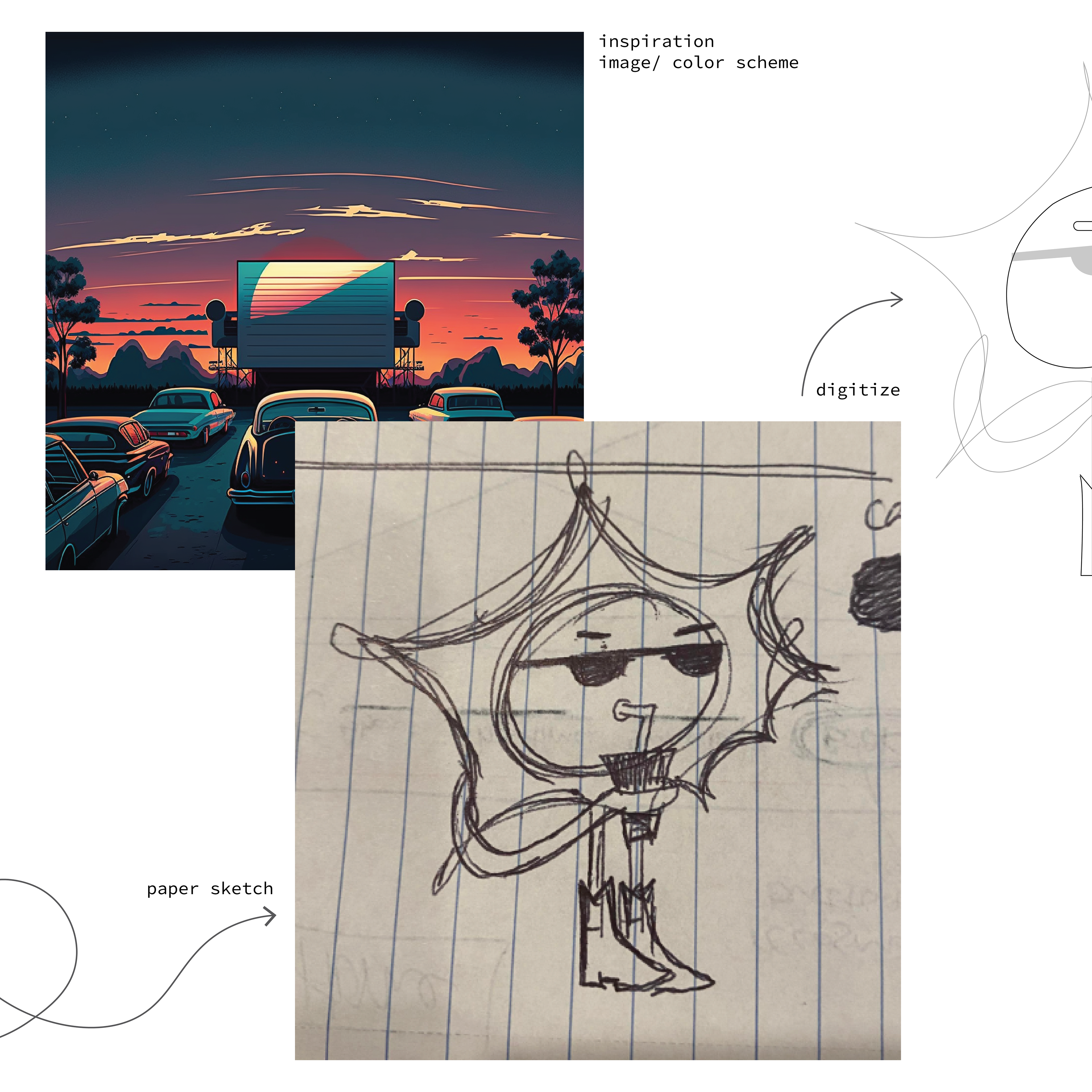
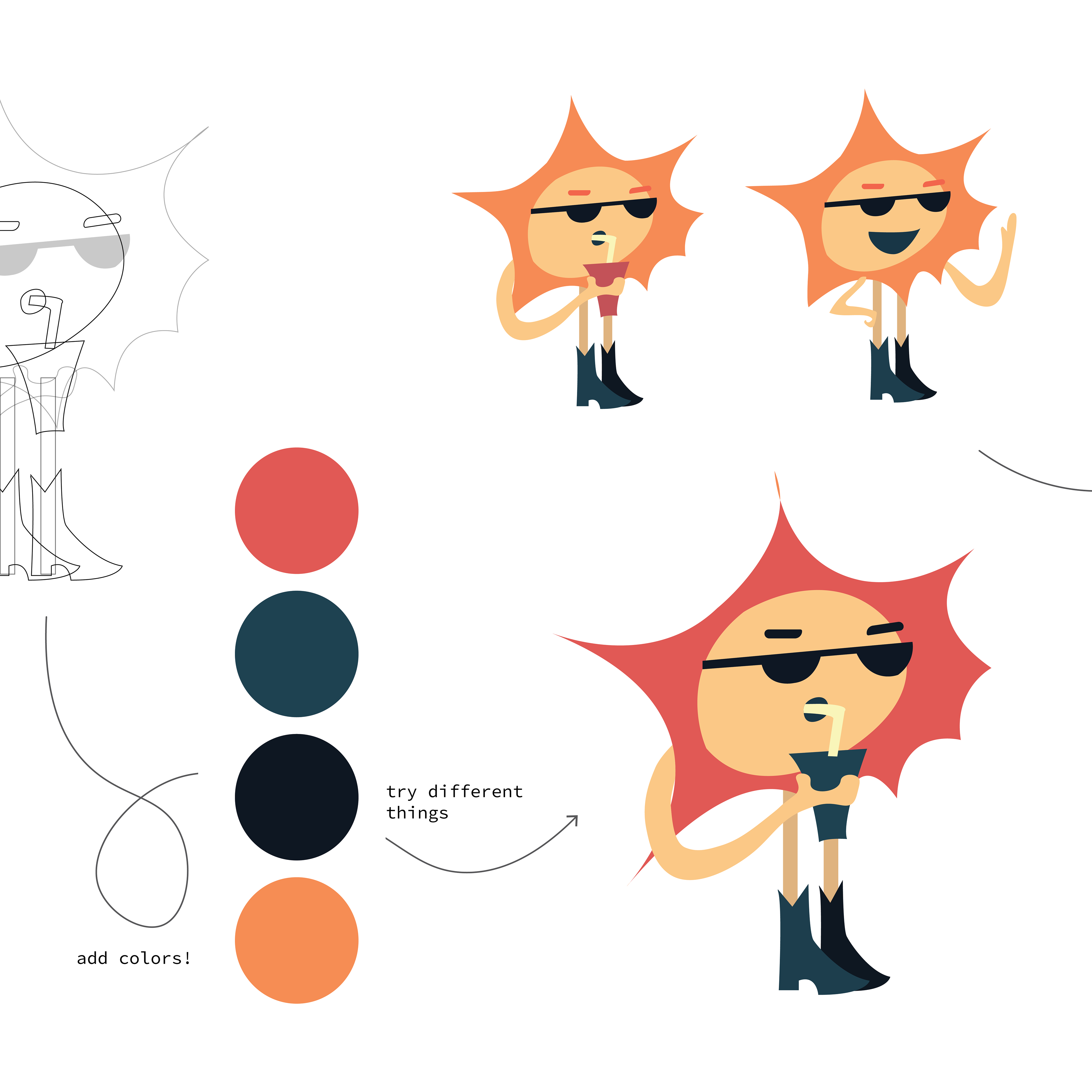
Mascot Breakdown
One aspect I personally did in the sketching exercise is thinking of incorporating a mascot. This is because the original Facebook page has a personable and interactable characteristic that visitors enjoyed. The use of a mascot would help carry over that personality on our website. On our prototype to come, Sunny the mascot will follow along on the user's journey to provide extra useful tips as they book a ticket on the sunset drive-in website!
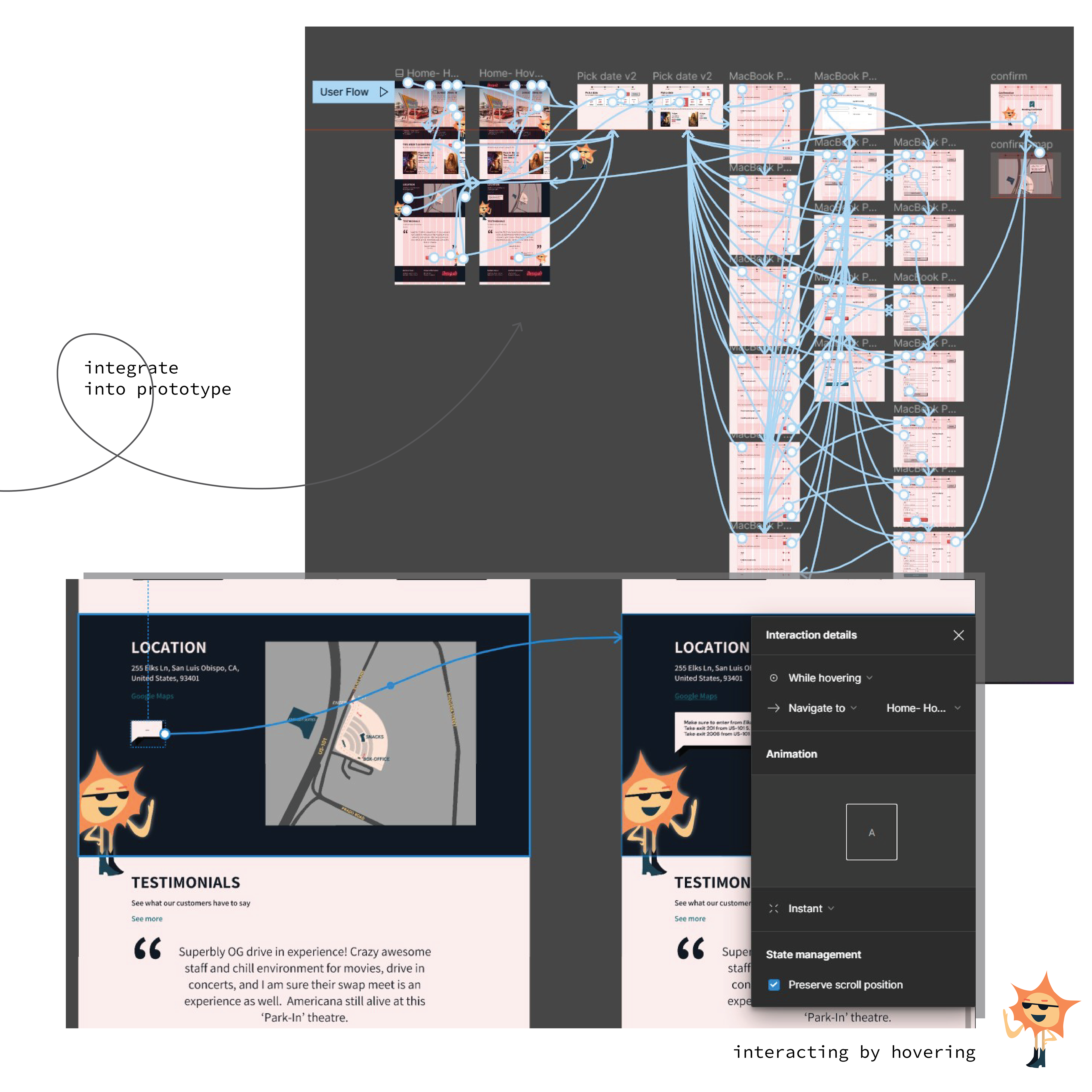
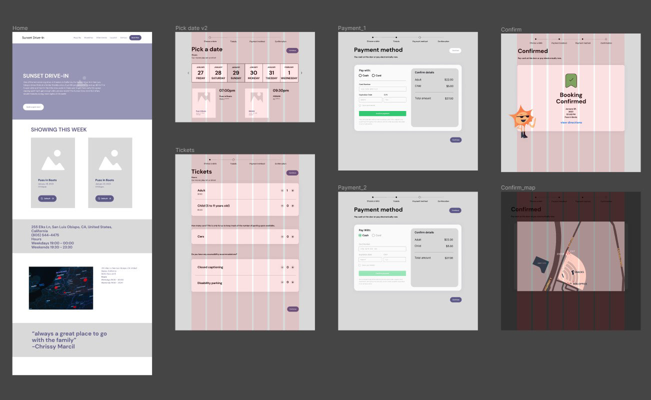
Mid-Fi Prototype
Transitioning into Figma, we focused our efforts on a mid-fidelity prototype by starting with digitizing our wireframe sketches. Utilizing Figma Community files helped a lot in this stage.
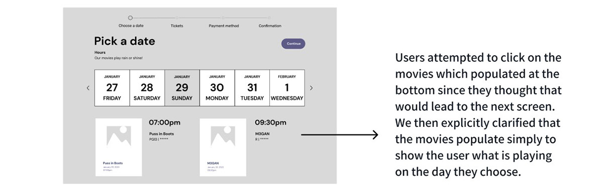
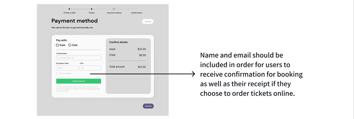
User Testing with Mid-Fi
We asked 5 students to navigate our prototype. Here is some of the feedback we received and applied.
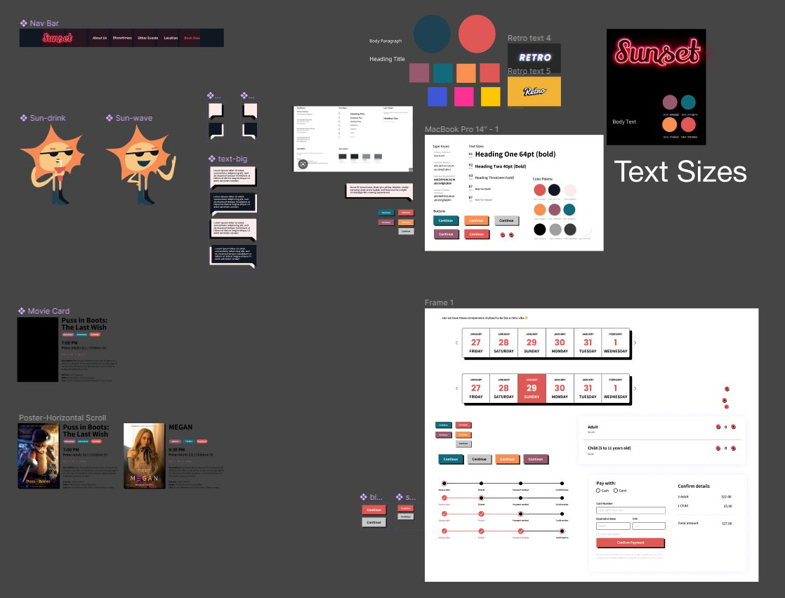
Design System
Typography
For the logo, we stayed consistent with the original Sunset Drive-in branding, and used a neon/retro font. For the headings and body text, we choose one Sans Serif typeface to keep our design consistent and compliment the retro logo.
There was a lot of information hierarchy within our layouts which made it important to have an organized system for our text.
There was a lot of information hierarchy within our layouts which made it important to have an organized system for our text.
Color Palette
Picked colors for the design that added to the retro and nostalgic feel of the Sunset drive-in.
Picked colors for the design that added to the retro and nostalgic feel of the Sunset drive-in.
Buttons/Components
We wanted to make all components match in style but still have a sense of individuality. We included a personable sun mascot to retain the same liveliness from the Facebook posts.
We wanted to make all components match in style but still have a sense of individuality. We included a personable sun mascot to retain the same liveliness from the Facebook posts.
last, but not least...
Final Prototype
Please click through our high-fidelity prototype below! It is best viewed on a desktop.
Presentation Slide-deck
Feel free to browse through our slide-deck and a copy of our Figma pages as well!
Conclusion
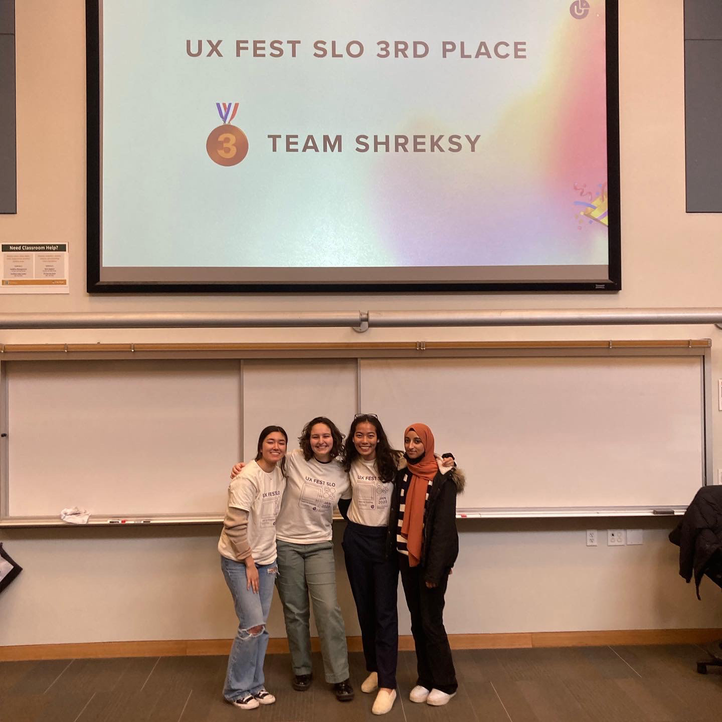
Wrapping up the weekend of this UX Hackathon, our team won third place!
With more time, we would like to focus on:
Responsive design: design to fit different sized-screens
Swap Meet: another aspect of Sunset’s business that happens on Sundays
Responsive design: design to fit different sized-screens
Swap Meet: another aspect of Sunset’s business that happens on Sundays